Inspiration:
How to paint a warm and cool still life painting, a tutorial for beginners on Will Kemp's site. The challenge is to use 2 colors and 2 brushes!!
I used a round brush and a filbert, sizes 6 and 10,
Burnt Sienna
Cobalt Blue
&
Titanium White
Will's original:
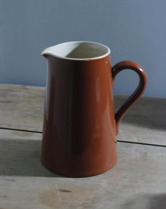
Will's finished still life:
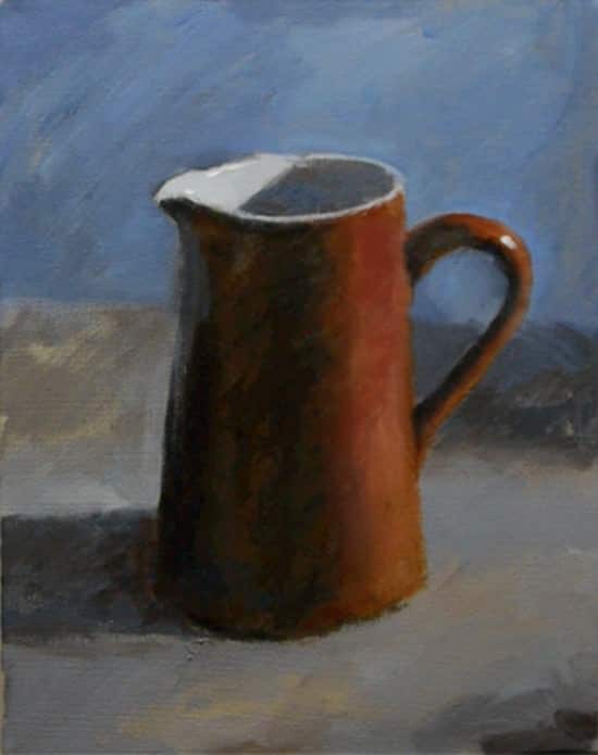
My attempt:

10" X 12" canvas paper
What I like about the painting:
- I'm beginning to like the background. It's growing on me.
- I am in awe of the changes as I painted, especially using the glaze with the Burnt Sienna.
- The end result looks 3-D
- The reflection under the lip of the jug needs to be more blue.
- I forgot the white reflections on the handle and edge of the jug
- I need to work on brush technique. When Will demonstrates painting different areas, it almost seems like he scrubs the canvas. When I try doing that I get brush marks. I'm not sure if it is the wrong brush, wrong canvas or wrong paint.
- If you are ever unsure of a color's family, add a bit of white to show where it would land on the color wheel.
- My picture ends up looking warmer than Will's painting and the original. I'm not certain, but it might be due to the light when I took the picture.
- The Burnt Sienna in my painting isn't as deeply colored as in the original. I'm thinking that is because that particular tube of paint is from a different manufacturer, one that is slightly less expensive.
- This isn't my favorite picture. In fact, I'm ready to paint over it! But, I am fascinated by how many colors and tones one can create with such a limited palette.
- Apparently I don't copy images well. I need to practice sketching and basic drawing.
What thoughts do you have?
I came over to see how you are doing..looks great to me! :)
ReplyDeleteActually, I liked the brighter color of your pitcher. Your painting pops and glows ~ has a liveliness to it lacking in the one above. I'm having so much fun watching you paint and reading your comments! You go!
ReplyDelete