Monday, December 30, 2013

#9: Winter

#9

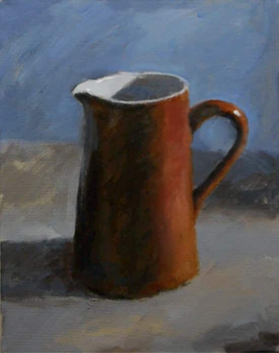
Inspiration for the painting: Will Kemp shared a photo of a painting on his web site, as an example of how to create a painting with only two colors of paint; Burnt Umber and Ultramarine Blue. I decided to try to copy it. 
Kemp's painting


#9
My version:
6" X 6" canvas

What I like about the painting:
  • I like the mood created by the colors. I can almost feel the cold.

What I might do differently
  • After watching Darrell Crow's video about blending mistakes beginners make, I realize I am the poster child for those mistakes! 
  • I worked on this photo from the top down, but I had to go back and adjust some items, making extra work for myself as I then had to redo layers below it. Because of that, I didn't do a lot of blending as Darrell demonstrated in his video. Ah, an opportunity for the next painting!

What I learned:
  • I was amazed by how much color could be created with only two colors of paint. 
  • I was unable to create some of the yellow tones that Kemp had in his painting.
  • In Crow's video I learned that red disappears a bit as it dries.
  • Blending can be done with a dry brush, using a variety of different types of strokes for different effects.
  • Crow uses very large brushes, dabbing them in the paint to load one side of them. 
  • It might be interesting to try to use the technique Crow demonstrates for blending clouds in making the snow in the foreground of this picture. He recommends leaving the top edge sharp. After dabbing paint on, he then uses a dry brush to blend the bottom edge with the background, using small circles. He continues with the dry brush to blend the bottom area into the middle. I think I could use some purple color for the shadowing, blending it in the same way. Then, as Crow demonstrates with clouds, add some lighter 'snow' on top, again leaving a bit of a sharp edge, but blending the lower edges in. This might create more depth.


Saturday, December 28, 2013

#8: She Sells Sea Shells

#8


3" X 3" canvas


Inspiration for the painting:

My older son gave me a few tubes of paint, and some brushes that I had requested for Christmas. He also sent two tiny canvases and a cute easel. My younger son was visiting, and one day proposed that we each try painting the same thing. He had collected a shell on the beach, so we chose to paint the shell. 

What I like about the painting:
  • I like the way the sky meets with the sea, and then how the sea meets with the beach. 
  • I like the clouds and the suggestions of waves.

What I might do differently
  • The horizon ended up to be a bit crooked
  • I think I should have made the sky and sea smaller, and add more detail on the beach, included the cup that would have formed around the shell by the action of the water, and maybe even a little puddle in front of the shell.
  • The shell seems to be floating above the sand, again, more detail might have anchored it.

What I learned:
  • I focused on trying to create a sense of texture, and think that the color choices helped achieve that effect. 

Tuesday, December 17, 2013

Duck...Duck...

#7: Goose

Inspiration for the painting:

One morning, before the sun had poked its head above the horizon, I heard a goose honking as he flew overhead, all by himself. The honks came in unison with the flaps of his wings. It was still dark, but I could just make him out against the sky. He was heading toward the lake in Dalhart, TX, where thousands of birds had begun to collect for the winter. I wondered why he was flying alone and imagined all kinds of stories to try to make sense of a single goose coming into the nesting area in the wee hours of the morning. Some day maybe I’ll write that story. I couldn’t get a picture of the goose, so I decided he would be the subject of my next painting. 


9" X 12" canvas panel

What I like about the painting:
  • I liked the way the colors of the background move from one color to the next. 
  • The tongue looks 3-D and the eye looks quite realistic.
  • I felt more comfortable dabbling paint on the body and neck and didn’t worry that they didn’t look much like the pictures of geese I studied.
What I might do differently:
  • I think beginning with light colors and building glazed layers on top would have added depth to the painting.
  • It might be interesting to stray from realism and, using a wide brush, just stroke on different colors for the feathers.
  • I need something in the background, not just the blue.
  • The goose looks flat. I suspect it is because I focused on color, not necessarily shadows.
What I learned:
  • I practiced using larger brushes first, and leaving the detail until the end.


Monday, December 9, 2013

#6: Less is More

I did a bit more reading on Will Kemp's Art School site. I am enjoying what he has to say. It sure makes sense to me, even as a rank beginner. One thing he states is that beginning with only a few colors, and a few brushes helps you make the most of what you have and teaches you brushing techniques that you can apply later, when you have more brushes to select from. He also encourages the beginner to use a larger brush, to force you to focus on the "big picture" instead of jumping right in to the details, something I tend to do. His reasoning about using only a few colors is that you have to do the best with what you have, and you are less likely to start mixing many different colors, creating a muddy mess.

Inspiration:
How to paint a warm and cool still life painting, a tutorial for beginners on Will Kemp's site. The challenge is to use 2 colors and 2 brushes!!

I used a round brush and a filbert, sizes 6 and 10,
Burnt Sienna
Cobalt Blue
Titanium White

Will's original:


Will's finished still life:


My attempt:

10" X 12" canvas paper

What I like about the painting:
  • I'm beginning to like the background. It's growing on me. 
  • I am in awe of the changes as I painted, especially using the glaze with the Burnt Sienna.
  • The end result looks 3-D
What I might do differently:
  • The reflection under the lip of the jug needs to be more blue.
  • I forgot the white reflections on the handle and edge of the jug
  • I need to work on brush technique. When Will demonstrates painting different areas, it almost seems like he scrubs the canvas. When I try doing that I get brush marks. I'm not sure if it is the wrong brush, wrong canvas or wrong paint.
What I learned:
  • If you are ever unsure of a color's family, add a bit of white to show where it would land on the color wheel.
  • My picture ends up looking warmer than Will's painting and the original. I'm not certain, but it might be due to the light when I took the picture. 
  • The Burnt Sienna in my painting isn't as deeply colored as in the original. I'm thinking that is because that particular tube of paint is from a different manufacturer, one that is slightly less expensive. 
  • This isn't my favorite picture. In fact, I'm ready to paint over it! But, I am fascinated by how many colors and tones one can create with such a limited palette.
  • Apparently I don't copy images well. I need to practice sketching and basic drawing.
What thoughts do you have?

Saturday, December 7, 2013

The Gift

The inspiration:

The other day I had a sudden, blinding, OMG inspiration! I was trying to do some Christmas shopping and was coming up blank. Then, I thought about my dad, who is 92 years young. He did some oil painting when I was a child. He also had a love for sports cars. I remember that Dad had an Alfa Romeo. I decided I would try to create a painting with my dad and me, and the Alfa, as a gift for him.

#5
5" X 7" canvas

The process:
  • I found an image of the Alfa online and traced it onto the canvas. 
  • I traced the image of the man and girl after tracing the Alfa. (Some day I will learn to draw!)
  • I cut a small hole out of a piece of paper and placed that over portions of the car (on my computer screen) to better be able to see the color. I found it really helpful to isolate a portion of the image.
What I like about the painting:
  • I was pleased with my attempt to make a shiny car with sparkling chrome
  • I sense a feeling when looking at the picture, perhaps longing. Perhaps it is only because of my emotions around my dad.
What I might do differently:
  • I am not a fan of the background. I had a number of thoughts going through my head; I wanted to focus on the car, I wanted to make it seem dream-like and I wanted to make it a stormy day. I am not a fan of the gloomy colors, although the sadness it brings does reflect my feelings about issues my dad has been experiencing as he ages.
  • It might be interesting to experiment with a glaze.... I've never done that before. I'd experiment on something else, first, however!
  • I might lighten up the sky
  • I liked preparing the canvas with another color. I think I'd use something closer to what I anticipate the background to end up.
What I learned:
  • I played around with three different blues to create green.  It was great fun to see the variations when Thalo, Cerulean and Cobalt blues were mixed with Cadmium yellow, light. The green with Thalo is perfect for a Colorado blue spruce!
The blues, moving clockwise from 'noon':
Thalo, Cerulean, Cobalt
  • I purchased a few tubes of Academy Acrylic and the others I have are Liquitex. I much prefer the texture of the Liquitex.
I decided I really hated the painting. The car gets lost in the grayness of the day. So, I chose to repaint the background. I really like that about working with acrylics. Here is version #2:


I'm not all that sure that I like it. Yes, the car seems a bit brighter, but the mood seems lost. Oh, and I just realized I forgot the shadows that dad and I would have cast.... back to the brushes!!

Friday, December 6, 2013

Going to School

I took advantage of our snowy, cold day to 'go to school' on the Internet. This time I visited the Will Kemp Art School. For today, I focused on the 7 painting success principles he lists:
  1. Colored Ground: never start with a blank, white canvas. Instead, it is suggested that with acrylic paints, begin with a canvas painted an opaque color. Kemp suggests an earth tone, and for beginners, he recommends using yellow ochre. The paint should be mixed with water to make it the consistency of custard. After painting the edges of a canvas, make strokes back and forth across the front. Dry the brush on paper towels and go over the canvas to smooth out the paint colors.
  2. Contrast: It is suggested that you have a range of contrasts, from black to white, in order to show off the colors. Kemp suggests that you work with three tones of color: the lights, the half-tones and the shadows. The toned ground is your mid tone.
  3. Composition: Kemp underscores the importance of keeping things different: gaps between fence posts and height and width of fruit in a still life, for example. He also explains the rule of thirds.
  4. Color Mixing: Kemp explains that Michael Wilcox suggests 6 colors for the basic palette, two variations in each of the three primary colors. The colors Wilcox uses are: cadmium red, quinacridone red, cadmium and hansa yellows, and cerulean and ultramarine blues. However, Kemp suggests that beginners start with a warm color and a cool color, and only use three colors: burnt umber, ultramarine blue and titanium white. In this way the beginner can focus on value of color, and not be distracted with all of the opportunities when mixing colors. Kemp created the painting below using only the three colors he recommended.
  5. Perspective: Kemp suggests the following for adding perspective to a painting: overlap, size and space (and considering the picture plane), and scale.
  6. Negative Space: beginner's often have a hard time dealing with space around an object, or an indication of where light is coming from. In addition, Kemp points out the need to avoid tangents (areas where lines of two objects meet).
  7. Glazing: some acrylic colors are more translucent than others, and can be used to glaze portions of a painting to slightly alter the tone and color of the underpainting. The use of a glazing liquid mixed with paint will also be effective for this process.

Thursday, December 5, 2013

#4: Foggy Winter Day

I attended my second lesson at the local Michael's. The instructor offered more instruction this time, and had us follow her, step-by-step, through the creation of the painting. She had a finished example of the painting on each table, which I found nice to use to get an idea of where we were going. However, the instructor did not follow the same techniques in painting the trees in the painting she modeled. The painting on our table had more detail. It was interesting to see two different styles and I'm actually not sure which finished painting I prefer. You can see that my 'ghost' trees, those in the fog, depict both styles. I did my first tree, the one on the left, adding the details I saw in the example on our table. I got ahead of the instructor, and misjudged what she wanted us to do.

#4
8" X 10" canvas panel

What I like about the painting:
  • I was pleased with the blending of the purple fog with the sky, and with the blending of the colors in the sky. I used the technique Schaefer demonstrated in his video.
What I might do differently:
  • I don't particularly care for the empty space behind the ghost trees, nor the sudden transition to colorful trees. 
  • I really don't care for the stream. I am thinking a stream in a winter scene such as this, would not be blue. If it were frozen, it would be covered by snow. If it weren't frozen, it would be very dark, and added details of rocks, with or without snow would add some interest.
  • I totally misplaced the bird. (Did you even notice the bird?!) First, he needs to be perched on top of the branch. Second, I feel that he gets rather lost in the tree behind him. I don't recall if the instructor's middle tree was placed that way, or not. Also, he is right in the middle. He should have been off of the center line.
  • I would take more care painting the bare tree. Some of my branches were too thick. I corrected much of this by making the entire tree larger, but there are still some branches that could stand to go on a diet.
What I learned:
  • We used light purple tick marks to identify the center lines of the canvas so we could be sure to place elements off center. We lightly drew in the lines of the horizon and the fog lines.
  • The instructor let me use her filbert brush for the trees. I liked the rounded edge. It was also used to make the grass clumps. 
  • I need to be more purposeful about sizing and placing objects if I am 'copying' another painting. The instructor's canvas was larger and somehow my trees ended up being the same size as her's and thus ended up too close to one another, or running off the canvas. 
  • I am too sparing with my paint, in all ways. I need to put out larger blobs of colors I know will be used a lot. In this painting, blue and white, followed by red. 
  • I need to mix larger amounts of paint - I kept running out of colors and had the added hassle of trying to replicate the color.

Wednesday, December 4, 2013

#3: Landscape a la Schaefer

Schaefer's landscape video inspired me to paint a landscape. I decided a view of our house would provide a similar landscape opportunity as the one Schaefer demonstrated, and I could incorporate a few of the techniques. Since we will be leaving on our motorhome in a week, I thought it might be nice to have a painting of our home to display while we are on the road. Thus, I chose to make a very small painting.

#3
4" X 5" canvas

What I like:
  • blending of the sky (but I wish I had started with a brighter blue)
  • shadows
What I might do differently:
  • colors are too bold in the background, and don't have shadows
  • find a way to bring viewers into the scene. It is rather static.
  • I might make the house smaller
What I learned:
  • small paintings don't necessarily take less time!
After thinking about this painting for a bit, I decided to add more to it. I put my horses in the painting, extended the fence and changed the color of the back hillside to try to give it more of an appearance of distance. Although I muted the color of the trees on the back hill, I forgot to add shadows and shadows for the horses. Those will be next... and then I will declare this painting 'finished'! (The colors look a bit different as one picture was taken with daylight and the other in the evening.)

#3.... almost finished


Tuesday, December 3, 2013

Instruction from the Internet

I am in awe of everything I have at my fingertips... literally! A quick search on Google about "how to paint with acrylics" yielded numerous options. I browsed through a few, and then stopped to watch a video by Brandon Schaefer. It's a looonnngggg video but I was mesmerized by watching Schaefer's techniques - oh, and I love his palettes - in fact, I half thought of calling my challenge, "100 Paper Plates" - and posting pictures of a growing stack of plates, just like those you can see on the right of the viewing area in this screen shot from Schaefer's video!


I picked up so much in just this one video and was thinking how much more inspired I would have been from my previous in-person lesson, had my instructor provided even half the tips!

Here are a few of my ah-hah's:
  • Skies are bluer at the top. Begin with blue, mixed with white and a hint of yellow. Add more white as you progress down, using the lighter color and painting up to blend it with the still-wet bluer paint.
  • Use X's to get the paint on the canvas initially.
  • Colors in the distance are lighter and more neutralized, and are blurred. The atmosphere makes things in the far distance appear purple. Use bolder colors in the foreground.
  • Begin your painting with a large brush and progressively move to smaller brushes as you get to more detail.


Brandon Schaefer's Web Site
Brandon Schaefer Facebook
Brandon Schaefer YouTube

Monday, December 2, 2013

#2: Sunflowers - a second attempt at a floral

Sunflowers
8" X 10" canvas board

After my first lesson I decided to make another stab at painting flowers. I felt much better about this painting. I didn't feel as rushed to "get 'er done" so I enjoyed the process more. 

Inspiration: sunflowers from our garden:

What I think I learned:
  • Acrylic paints dry darker than they appear when they are wet.
  • Next time I will paint the entire canvas with the background color, then I'll trace my subject, or sketch it on the canvas.
  • I like the shadows in the sunflower centers, but my image just doesn't 'pop' like the original; is it my darker, more orange colors? or is it because there is less contrast between the background and the flowers?


Sunday, December 1, 2013

#1: Columbines - the beginning

Columbine

This is my first attempt at painting. Well, maybe not my very first, I do recall the enjoyment of standing at the easel in kindergarten, using the long-handled brushes and swiping bright swaths of tempera paint across large sheets of newsprint!

I created this painting in an art class at our local Michael's art store. I happened to be in the store previously, when they were offering various art classes at two for the price of one. Since I had often thought it would be interesting to learn to paint with acrylics, I signed up for two lessons.

I was very disappointed in my lesson. The instructor didn't do a whole lot of teaching. She did show us how to use the transfer paper to trace the image onto the canvas board. She cautioned us to be aware of what side we had facing the canvas, however, being that I was a bit more advanced in age than some of my classmates, I have had enough experience with carbon paper in my life that this tidbit of knowledge was superfluous. 

We were instructed to put a dollop of blue, red, yellow, white and black on our palette papers. She assumed we had rudimentary knowledge of color theory.  Then, we were told to go ahead and paint, starting with the background. 

Other 'take-aways' for me:
  • Mix paints with the pallet knife, so the brush doesn't get 'gooped' up 
  • Don't leave brushes standing in the water as the wood in the ferrule between the brush hairs and the handle might shrink or weaken.
I was very frustrated. After painting the background a dark green, working carefully around the outlined flowers, I moved on. I completed most of the flowers in class and a few days later added a few more touches to the very light areas and the yellow. I also played with the background, but found the busy-ness to be a bit overwhelming. I was not thrilled with the choices of flowers that were available to me, so that may also have entered into my disinterest in dealing with the details. 

What I like about the painting: 
  • The shading of the central flower works. The two white petals on the right, especially, have a bit of a 3-D look.
  • The shadows in the leaves, especially along the bottom, helps bring depth to the picture. However, I see now that I should have incorporated more light where shafts of sunlight came through.
What thoughts or suggestions do you have?

Saturday, November 30, 2013

The Challenge


I recently followed a link on Facebook to a story about a woman who participated in a 100-day video challenge to learn how to walk again. From there, I watched video clips of other people who were practicing something for 100 days. I loved the premise of this challenge, after-all, practice makes perfect. But what goal, I wondered, did I want to pursue that I could log progress over a significant period of time? The first thought was that I could finally learn how to ride a unicycle!


That was a dream of mine for many years, but sadly, Santa never brought me a unicycle. However, I began to envision road rash on my knees, bruises in places that haven't seen black and blue for a long time, and trips to the ER with sprained wrists. I am thinking that perhaps learning to ride a unicycle at my age is inadvisable.

Then, as I responded to a comment on a recent post I published on Living a Dream, I realized I had my challenge! I will adapt the 100-Day Challenge to become a 100-painting challenge, which may take considerably longer (especially with our travel schedule) than 100 days. I will record my progress in creating art and share some of my thoughts and ah-hahs on this blog.


And, my next challenge? 
Figuring out what to do with 100 paintings!!