- Colored Ground: never start with a blank, white canvas. Instead, it is suggested that with acrylic paints, begin with a canvas painted an opaque color. Kemp suggests an earth tone, and for beginners, he recommends using yellow ochre. The paint should be mixed with water to make it the consistency of custard. After painting the edges of a canvas, make strokes back and forth across the front. Dry the brush on paper towels and go over the canvas to smooth out the paint colors.
- Contrast: It is suggested that you have a range of contrasts, from black to white, in order to show off the colors. Kemp suggests that you work with three tones of color: the lights, the half-tones and the shadows. The toned ground is your mid tone.
- Composition: Kemp underscores the importance of keeping things different: gaps between fence posts and height and width of fruit in a still life, for example. He also explains the rule of thirds.
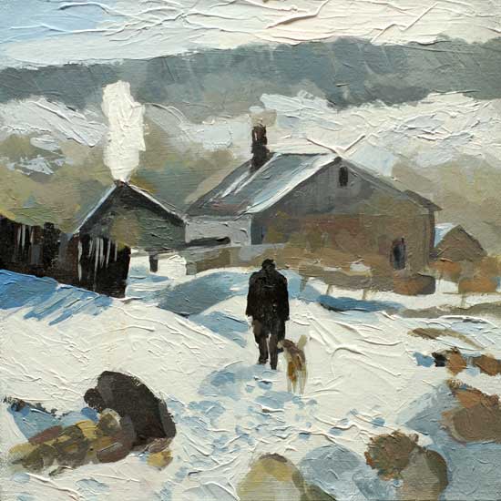
- Color Mixing: Kemp explains that Michael Wilcox suggests 6 colors for the basic palette, two variations in each of the three primary colors. The colors Wilcox uses are: cadmium red, quinacridone red, cadmium and hansa yellows, and cerulean and ultramarine blues. However, Kemp suggests that beginners start with a warm color and a cool color, and only use three colors: burnt umber, ultramarine blue and titanium white. In this way the beginner can focus on value of color, and not be distracted with all of the opportunities when mixing colors. Kemp created the painting below using only the three colors he recommended.
- Perspective: Kemp suggests the following for adding perspective to a painting: overlap, size and space (and considering the picture plane), and scale.
- Negative Space: beginner's often have a hard time dealing with space around an object, or an indication of where light is coming from. In addition, Kemp points out the need to avoid tangents (areas where lines of two objects meet).
- Glazing: some acrylic colors are more translucent than others, and can be used to glaze portions of a painting to slightly alter the tone and color of the underpainting. The use of a glazing liquid mixed with paint will also be effective for this process.
Friday, December 6, 2013
Going to School
I took advantage of our snowy, cold day to 'go to school' on the Internet. This time I visited the Will Kemp Art School. For today, I focused on the 7 painting success principles he lists:
Labels:
Kemp,
principles
Subscribe to:
Post Comments (Atom)

You always provide such useful info! :)
ReplyDelete